

The right color can make an outfit feel considered without competing with your pet’s natural markings. A deep brown dog may stand out in a bright, cool blue, while a pale cat can nearly disappear against cream. But there is no single best color for any coat: lighting, pattern, personal taste, and the occasion all affect how a shade looks.
Start with your pet’s coat as the backdrop, then decide what you want the color to do. It can create crisp contrast, echo a subtle undertone, or add a cheerful accent for a photo. These ideas work for clothing and decorative accessories, but appearance should never outweigh fit or your pet’s willingness to wear them.
Start with the coat’s lightness and depth
A simple first step is comparing a color’s lightness with the coat. A dark coat often gives lighter or brighter colors a clear outline; a pale coat can make deeper shades easier to see. On a black dog, for example, a red bandana or shirt may read distinctly, while a charcoal accessory may blend in. These are visual tendencies, not rules—an all-dark look can be appealing when a quiet, coordinated effect is the goal.
For a cream or white coat, try a saturated color such as forest green, burgundy, or navy if you want the accessory to show in a picture. Soft blush, pale gray, and other light shades create a gentler effect but may have less separation from the fur. Consider the whole scene, too: a pale pet photographed against a bright wall may need a darker accent to remain visually distinct.
Notice warm and cool undertones
Coats have undertones as well as surface colors. Golden, apricot, rust, and many warm browns tend to look harmonious beside earthy greens, warm reds, and creamy neutrals. A red-gold retriever might wear olive for a relaxed, blended palette or teal for more contrast. Think of undertones as a helpful starting point rather than a color-matching test; natural light can change how both fur and fabric appear.
Cool-looking coats—blue-gray, silver, or some black coats—can pair neatly with icy blue, berry, plum, or crisp white. A gray cat against a soft lavender accessory may give a subdued impression, while a vivid coral brings a livelier note. If you are unsure whether a shade feels too warm or cool, hold it near the coat in daylight and compare it with a second option.
Use contrast to make markings easier to see
For pets with distinctive markings, color can frame rather than obscure their pattern. A dark harness-free shirt on a white-and-brown dog may make the coat’s lighter patches more noticeable, while a simple solid color can keep a busy brindle pattern from looking crowded. Look at the pet’s face and chest, where markings are often most visible, before choosing a neckline or garment color.
A coat with high-contrast patches can already supply plenty of visual activity. In that case, a single solid shade often makes a calmer pairing than a large, multicolored print. Conversely, a solid-colored pet can carry a more playful accent without competing with stripes or spots. Check the finished look from several angles, especially when a garment has a prominent back detail or a hood.
Treat neutrals as useful, not automatic
Black, gray, brown, cream, and white are practical palette anchors because they can connect several colors in an outfit. A gray accessory may sit comfortably beside a silver coat; a warm brown can echo a tan one. Yet matching fur exactly is not always the most visible choice. A near-match may look polished in person but disappear in a photograph, particularly in shade or against a similarly colored background.
Instead of searching for an identical neutral, vary its depth or temperature. Pair a light coat with charcoal rather than pale gray, or choose a warm ivory beside a golden coat. For a dark pet, a lighter neutral can outline the accessory; for a pale pet, a deeper neutral can define it. Keep other styling details simple if you want the coat and chosen color to remain the focus.
Choose prints and accents with intention
A print can introduce a color that would feel too bold in a large block. If your dog has a red-brown coat, a small pattern with green details may pick up the coat’s warmth while adding contrast. With a heavily patterned or multicolored coat, look for one shade already present in the fur and repeat it in a restrained accent. That creates a connection without requiring every color to match.
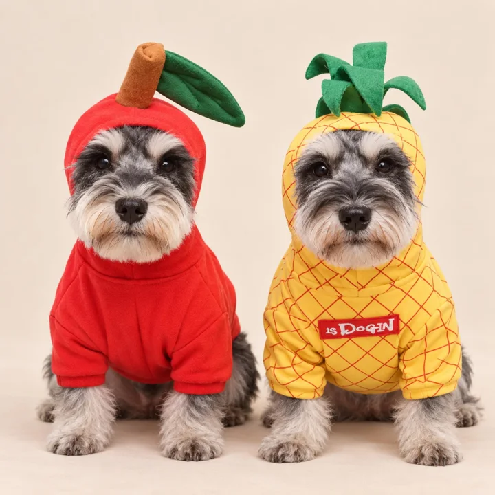
Three-dimensional details and decorative trims add another visual layer. A plush accent, bright brim, or contrasting edge may draw the eye as strongly as the main fabric color. Consider whether that focal point competes with facial markings or helps balance them. For example, a lighter detail on the back can show clearly in a side or rear view, while a detail near the face may dominate a portrait.
Let the setting guide the palette
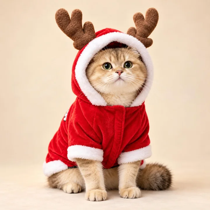
A color that looks striking indoors may blend into an outdoor background. For holiday photos against evergreen branches, red, cream, and gray can create visible separation; against autumn leaves, a deep green or blue may stand apart more clearly than orange. For everyday outings, choose colors you enjoy seeing repeatedly and that work with the places you tend to visit. The setting should inform the choice, not dictate it.
Lighting also matters. Warm indoor bulbs can make cream and orange look more golden, while open shade may soften bright colors. If a photo is the main purpose, test the outfit in the actual location and take a quick picture from the planned angle. A color that seems vivid to the eye may look muted on a phone screen, and a subtle trim may disappear from a distance.
Compare real catalog colors thoughtfully
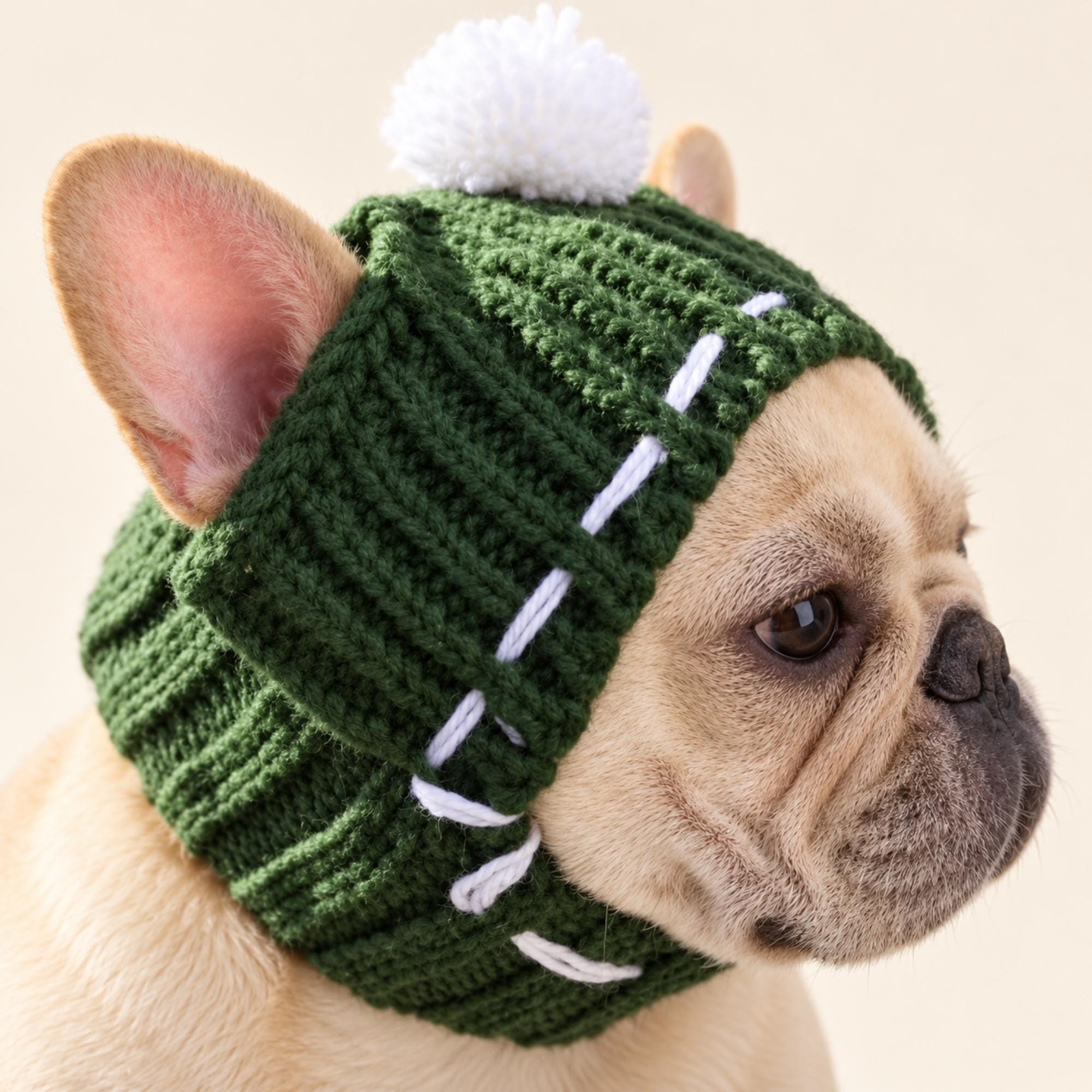
Catalog examples can help make color choices concrete. The knitted pet hat is offered in gray, red, and dark green: gray gives a classic neutral effect, while red or dark green supplies a stronger seasonal accent. Its white pom pom and decorative yarn details add contrast of their own. Think about how those lighter details will sit against your pet’s coat, as well as how the main color looks.
The teddy bear dog shirt comes in green and orange, two noticeably different options for an everyday look. Green can feel quieter beside some coats, while orange is a brighter accent; the result depends on the animal’s markings and the surrounding light. A cream-and-caramel teddy bear cape uses multiple warm neutrals, so it may blend softly with a tan coat or contrast more clearly with a dark one.
Make willingness and fit part of the choice
Color is only one part of selecting apparel. Check the product’s size guidance and make sure the garment does not obstruct movement, vision, breathing, or access to the litter box. Introduce clothing gradually, supervise your pet, and stop if you notice discomfort or attempts to remove it. Some cats reject apparel, and that response deserves respect; a decorative accessory or no outfit at all may be the better choice.
Decorative neckwear and photo accessories should not be treated as walking restraints. Do not assume a closure has a breakaway feature or a particular safety rating unless the product description says so. When your pet seems relaxed and the fit is appropriate, color can be a fun finishing touch. When an accessory causes stress or gets in the way, remove it, regardless of how well it matches.
A thoughtful next step
For a quick decision, compare two colors beside your pet in natural light, note whether you want contrast or coordination, and consider the coat’s markings and the setting. Choose the option that remains visible without overwhelming the overall look, then check fit and your pet’s response. The best color is not necessarily the trendiest or most perfectly matched one—it is the shade that suits your pet and the moment.
Explore our Apparel & Costumes collection, check measuring and fit guidance, or ask us about a product detail before choosing.
Pieces mentioned in this guide
These are catalog examples, not a promise of fit or availability. Read each listing and confirm the details before ordering.